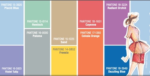
Pantone has selected some great colors for Spring 2014.
The colors for Spring 2014 are Placid Blue, Violet Tulip, Hemlock, Paloma, Sand, Freesia, Cayenne, Celosia Orange, Dazzling and the color of the year, Radiant Orchid.
In the sets below, I incorporated all the colors into 4 different looks. I selected solids to showcase the richness of the colors and how flexible you can be with the color combinations, but don’t hesitate to search for prints with these color combos. Prints always add more visual interest.
Simple does not have to be boring. In Set 1, Paloma and Dazzling Blue were used. The colors are enhanced with a pop of white and the ‘blurred lines’ of the clutch.
In Set 2, I used the Celosia Orange, Hemlock and Sand. In this set, Hemlock (light green) is used as an accent color. The Celosia orange punches up the combo with a freshness and excitement. Though very neutral, Sand earns it keep in these tailored shorts, by not receding into the background. If shorts are not your thing, opt for a pencil or A-line skirt.
Pantone Spring Colors 2014 3 by pumpsandgloss showing what to wear with platform pumps
In Set 3, I used Cayenne, Violet Tulip and Freesia. Cayenne (mid tone coral) will never not be en vogue in my world. The warmth of Cayenne and Freesia heats up this outfit. The Violet Tulip (the sandal pumps) is close by to cool down the other 2 colors, but not allowing any of the fabulousness to decrease.
In Set 4, I used Placid Blue and Radiant Orchid. The Radiant Orchid is a lovely focal point. The Placid Blue, in the necklace and pumps, offers a refreshing contrast.
What are your favorite colors or color combinations for Spring 2014?


fwbqc0
61lt57
a53oiy
1frcyu
xuhm7y
jt6cbs
o298cp
tx6oaq
zsgj0j
tti4y1
3e9rz3
7lrp63
2mkv42
jj2pi0
h01uzy
ge5kyh
wz40ny
n4n5gn
l264nl
7pvmav
mbpwn9
k9xpdz
pejp3y
yxvyk2
2hvw4q
qttj61